Let the city be the first choice.
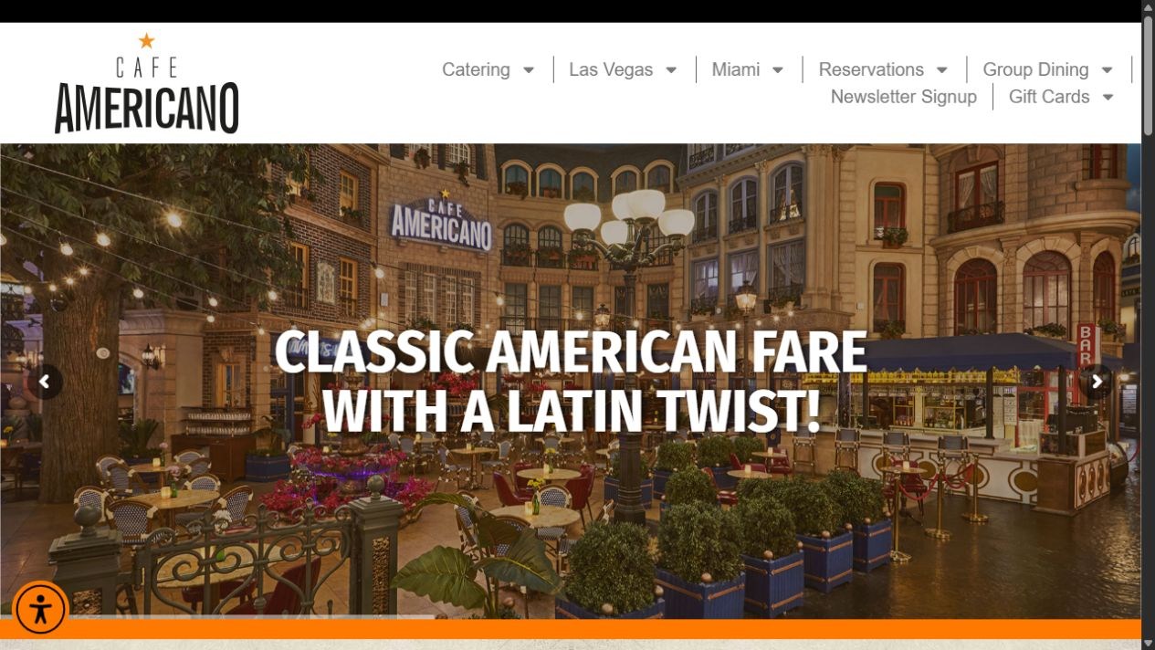
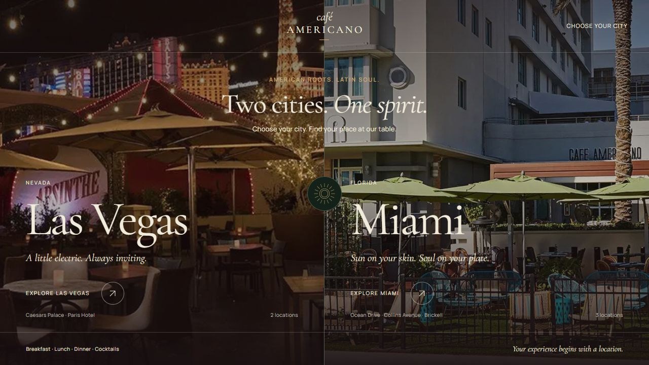
The public opening combines a restaurant photograph, a headline, and several navigation choices. The concept presents Las Vegas and Miami as two distinct photographic entrances.
Independent concept redesign / Restaurant
Two cities, five restaurant experiences, and a clear place to begin. This concept introduces Café Americano through the character of Las Vegas and Miami before guiding guests to their restaurant.
The opportunity
The public website gathers city links, dining information, and reservations on one homepage. The concept makes location selection the opening decision, using photography to distinguish each city and restaurant. These are design hypotheses, not measured performance results.
The journey we designed
Two photographic choices introduce Las Vegas and Miami.
Question answered
“Which city am I visiting?”
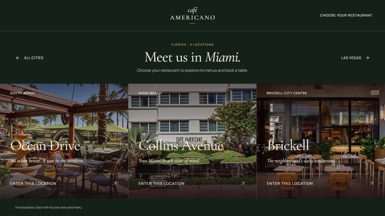
The Miami selection brings three restaurants into one view.
Question answered
“Which location suits my plans?”
Each restaurant offers a route into its own menus.
Question answered
“What can I order here?”
Restaurant selection provides context before planning a visit.
Question answered
“Where should we meet?”
Screen by screen
Four comparisons follow the redesign from city selection to the Ocean Drive restaurant page and its breakfast menu.
The public opening combines a restaurant photograph, a headline, and several navigation choices. The concept presents Las Vegas and Miami as two distinct photographic entrances.
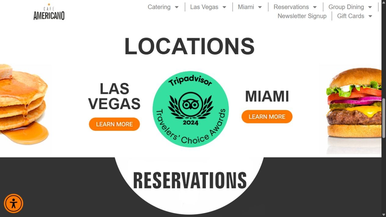
The original homepage groups locations under city links. After choosing Miami, the concept presents Ocean Drive, Collins Avenue, and Brickell together, with a photograph and direct entrance for each.
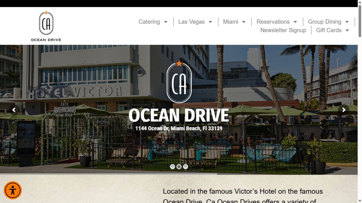
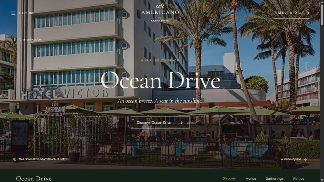
The public restaurant page introduces Ocean Drive with a slideshow and a large location logo. The concept gives the same setting more space, pairs it with a short invitation, and keeps reservations and restaurant navigation close.
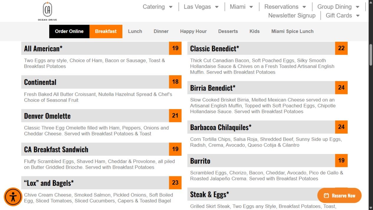
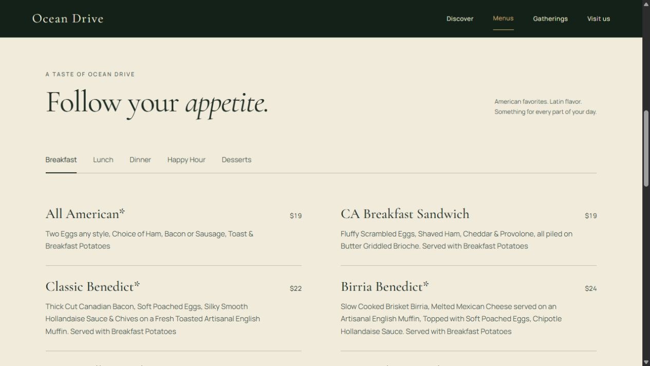
The public breakfast menu uses compact columns with gray title bars and orange prices. The concept presents a selected breakfast menu with more space between dishes, category tabs, and links to the full published menus.
Explore the redesign
Four more before-and-after comparisons show how the Ocean Drive story, dining choices, gatherings, and visit details come together.
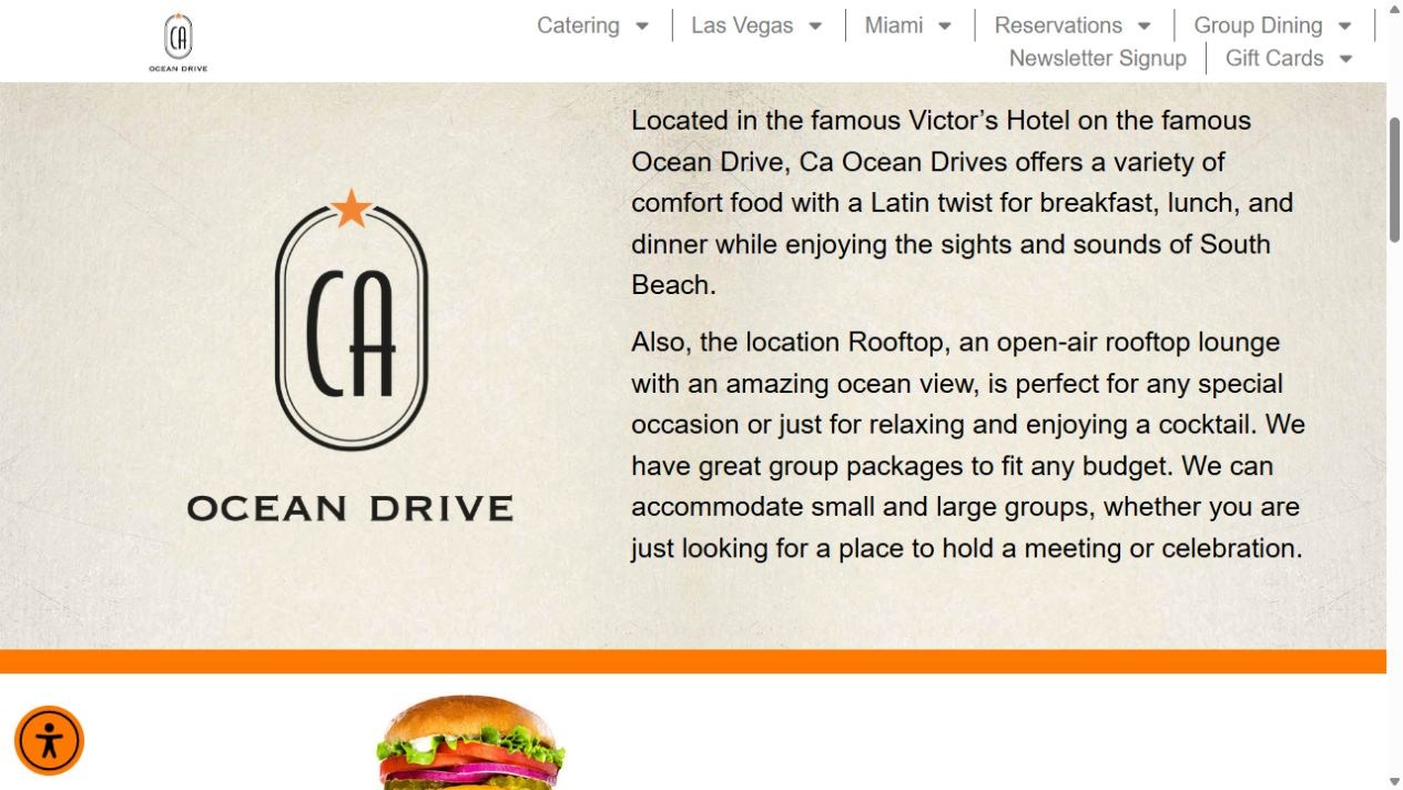
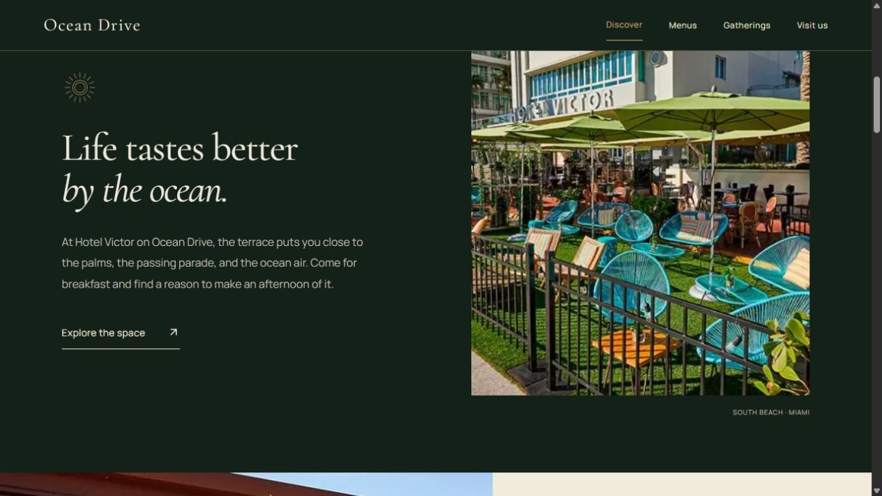
The public page pairs a large logo with two paragraphs. The redesign introduces the restaurant through a shorter story, deep green typography panels, and terrace photography.
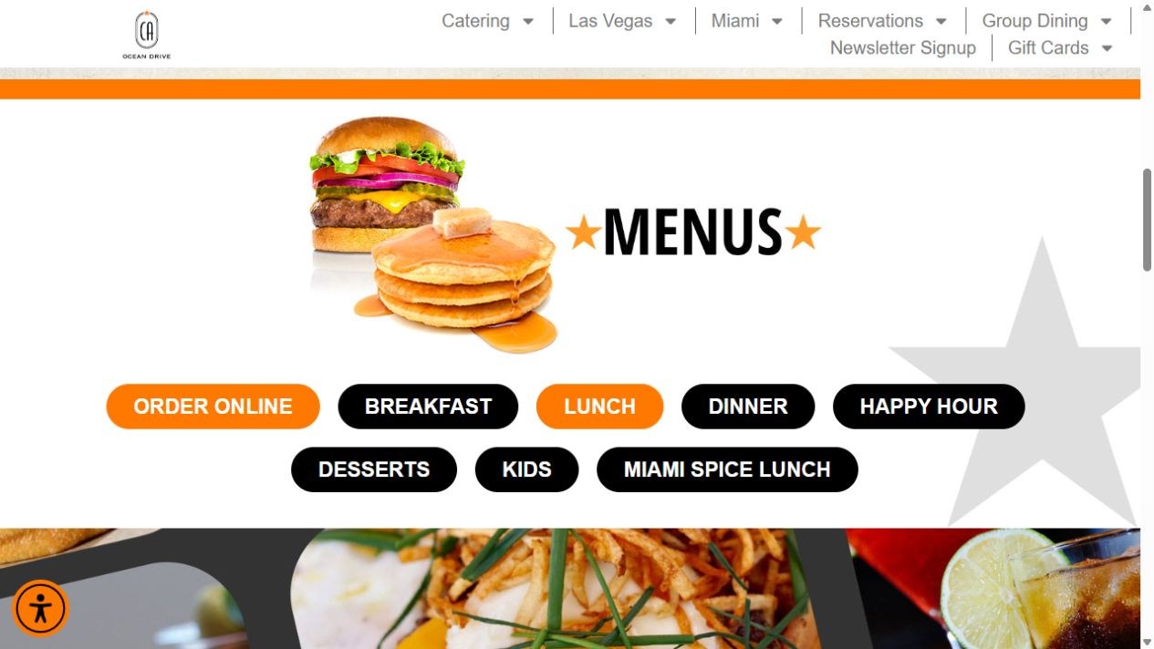
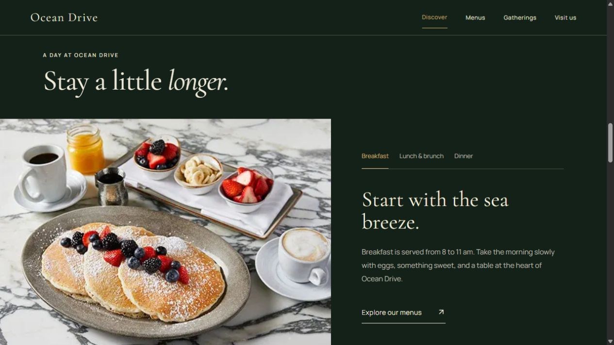
The public site presents a group of menu buttons. The redesign pairs food photography with breakfast and lunch-and-dinner tabs, giving each part of the day its own introduction.
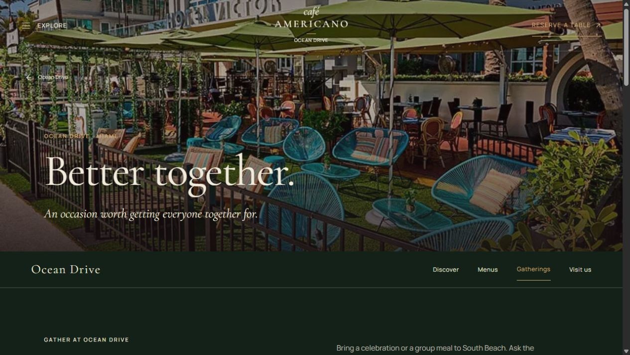
The public page uses a compact group dining banner. The redesign gives gatherings a dedicated page, led by terrace photography and a direct invitation to plan an event.
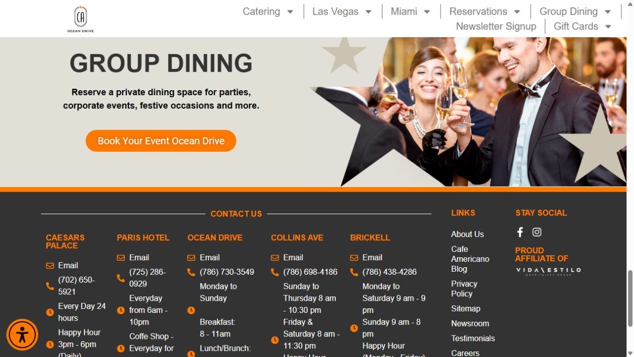
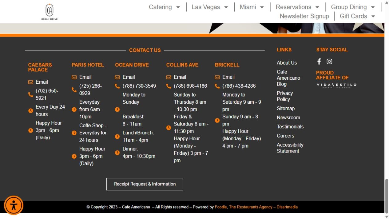
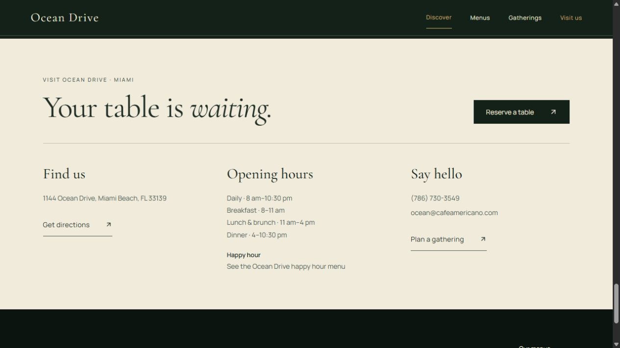
The public footer lists contact details for five restaurants together. The redesign brings Ocean Drive’s address, hours, directions, contact information, and reservation action into one local section.
More restaurant work
Explore more of the restaurant collection.
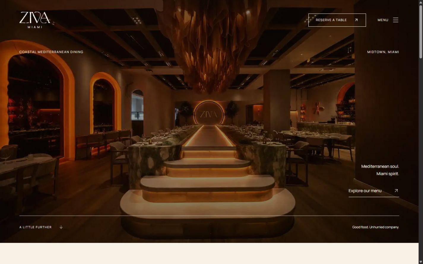
Mediterranean dining & evenings
A warm dining room, Mediterranean dishes, and the details guests need to plan an evening in Midtown.
Independent concept redesign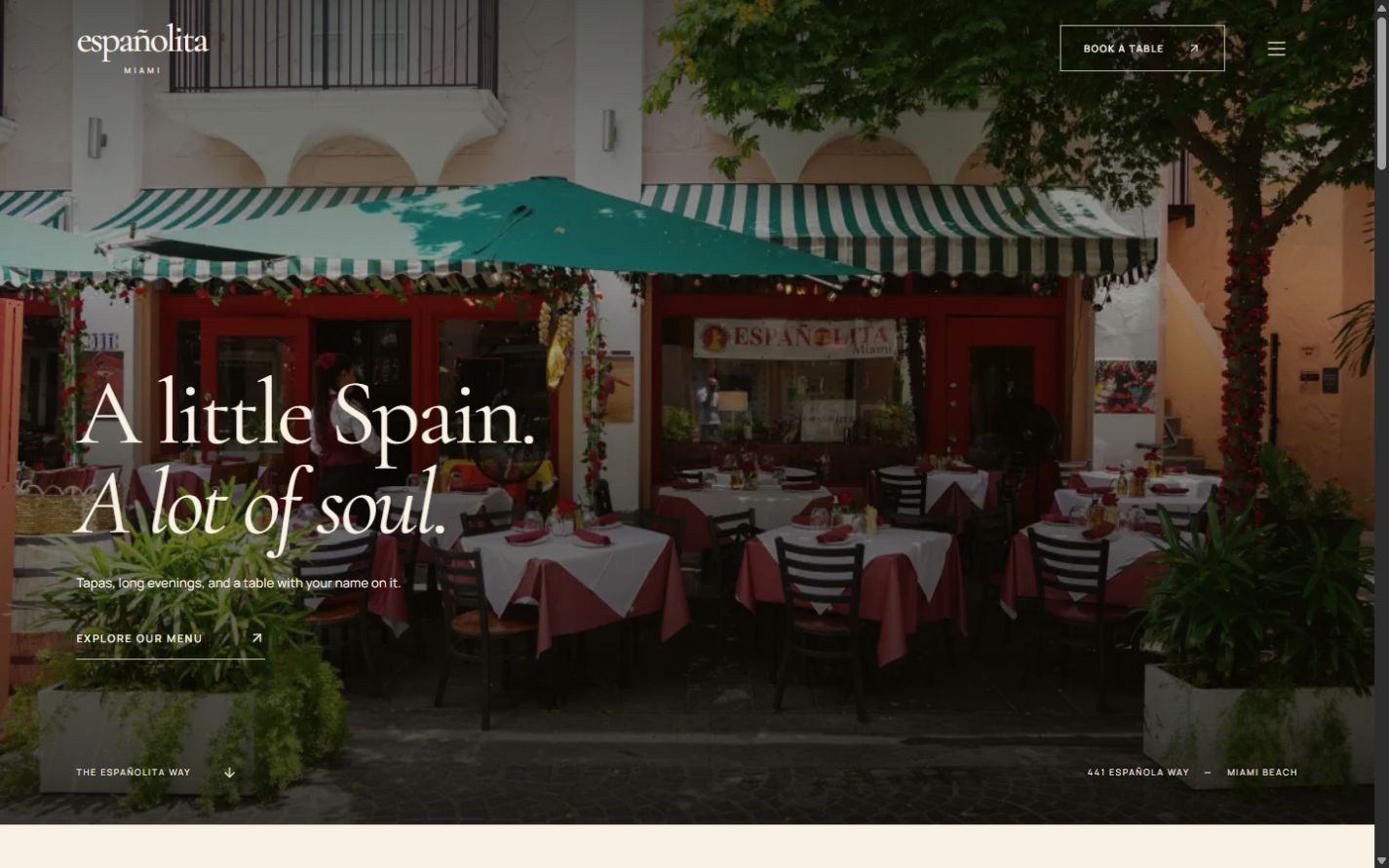
Spanish dining & reservations
An open-air Spanish table, shared plates, and a searchable menu that leads naturally to a visit.
Independent concept redesignSelf-initiated concepts, not commissioned by or affiliated with the restaurants shown.
View all restaurant work