Appetite first.
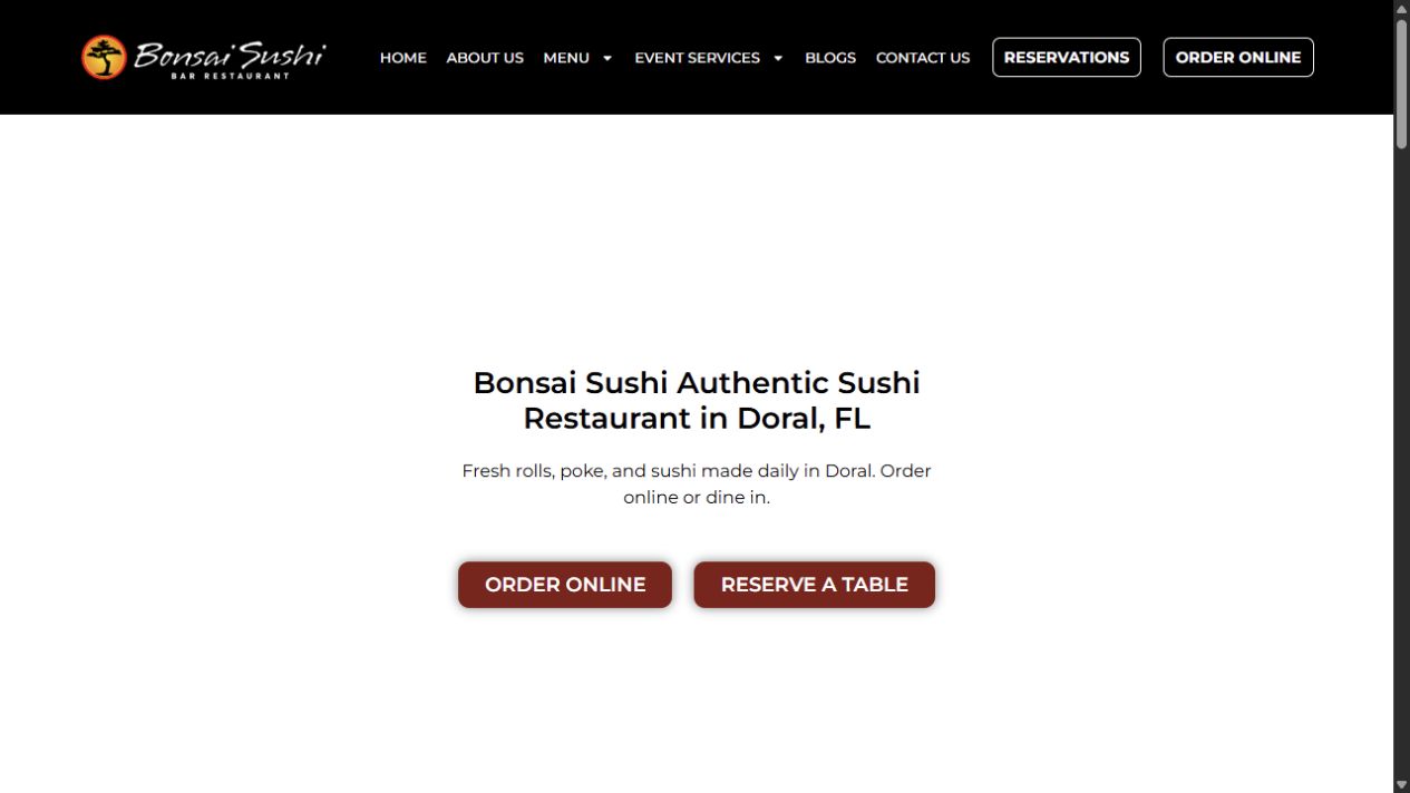
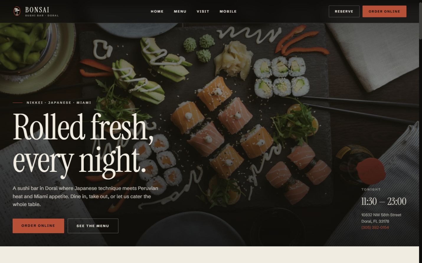
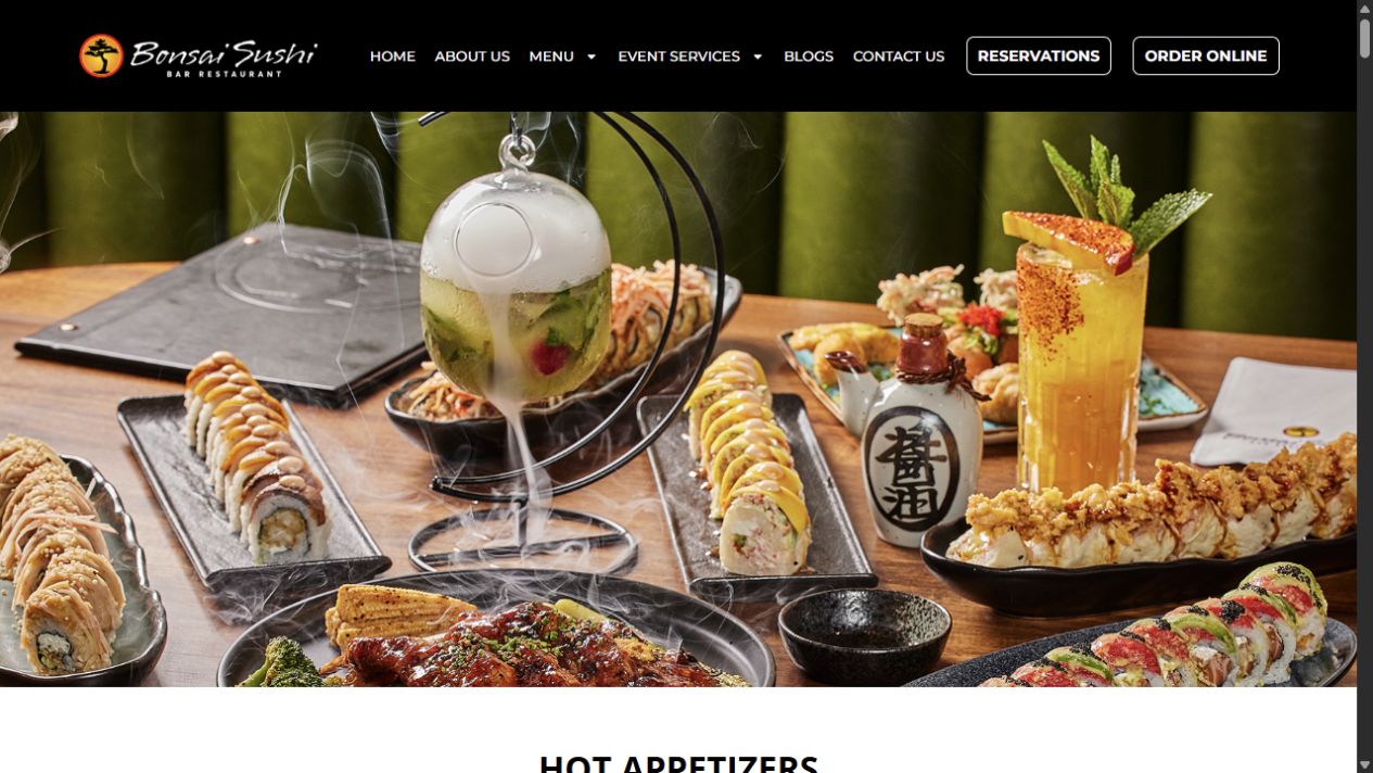
The homepage leads with the food and holds only two actions: reserve or order online.
Independent concept redesign / Restaurant
A full-site concept for a Doral sushi restaurant, bringing menu discovery, weekly offers, catering, ordering, and visits into one deliberate customer journey.
The opportunity
The public site already carries a broad menu, online ordering, reservations, recurring offers, catering, and location details. The concept reorganizes those real customer jobs into a stronger visual sequence without claiming access to private analytics or conversion data.
The journey we designed
One photograph, one line, two actions. The opening screen sells the food before it sells the restaurant.
Question answered
“Do I want this?”
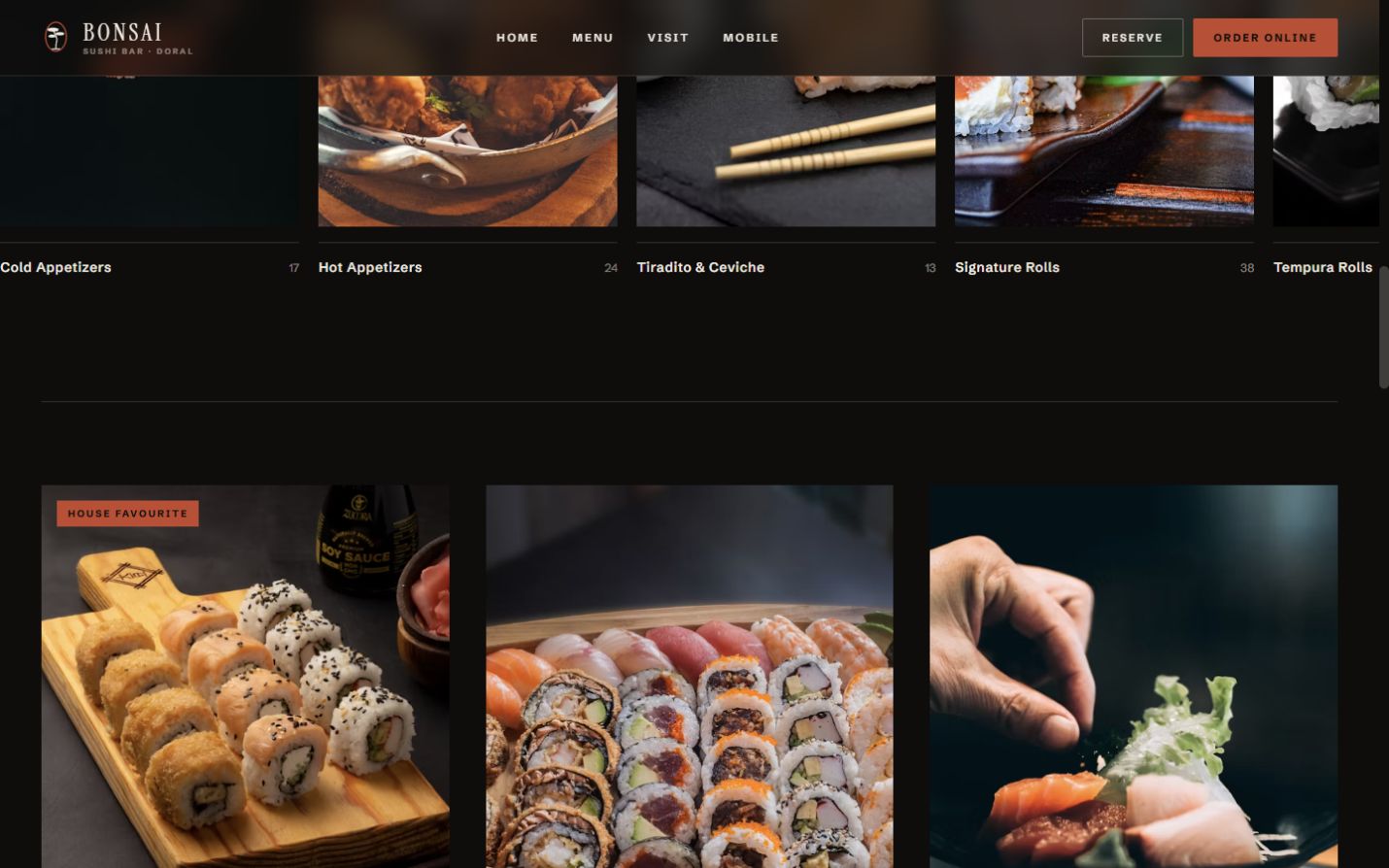
Photographed categories and house favourites turn a wide menu into a set of clear starting points.
Question answered
“What can I order?”
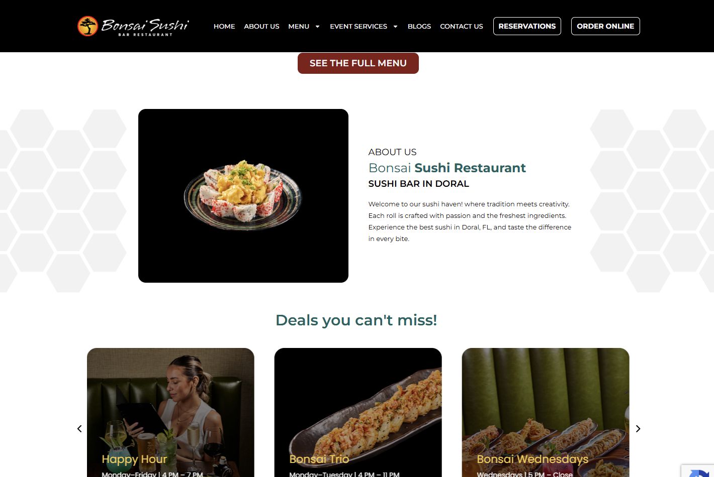
Lunch, happy hour, and weekly specials surface together, with their days and hours attached.
Question answered
“Why tonight?”
The kitchen’s own story sits between wanting the food and committing to the table.
Question answered
“Are these people serious?”
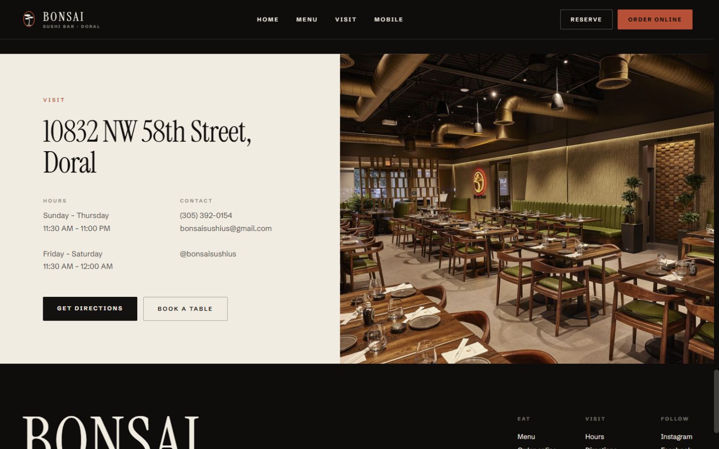
Address, hours, phone, directions, and booking finish on one screen beside the room itself.
Question answered
“How do I get there?”
Screen by screen
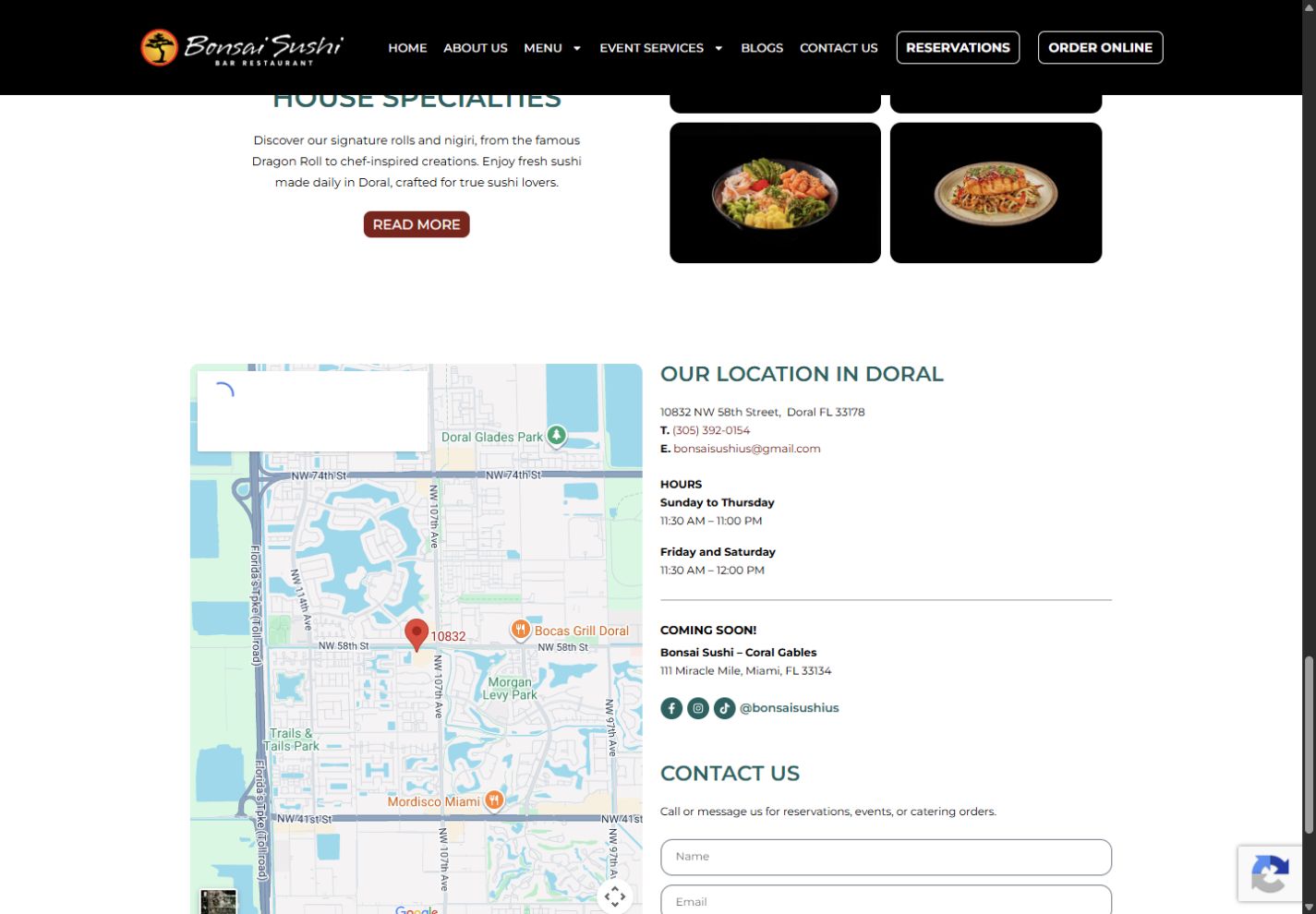
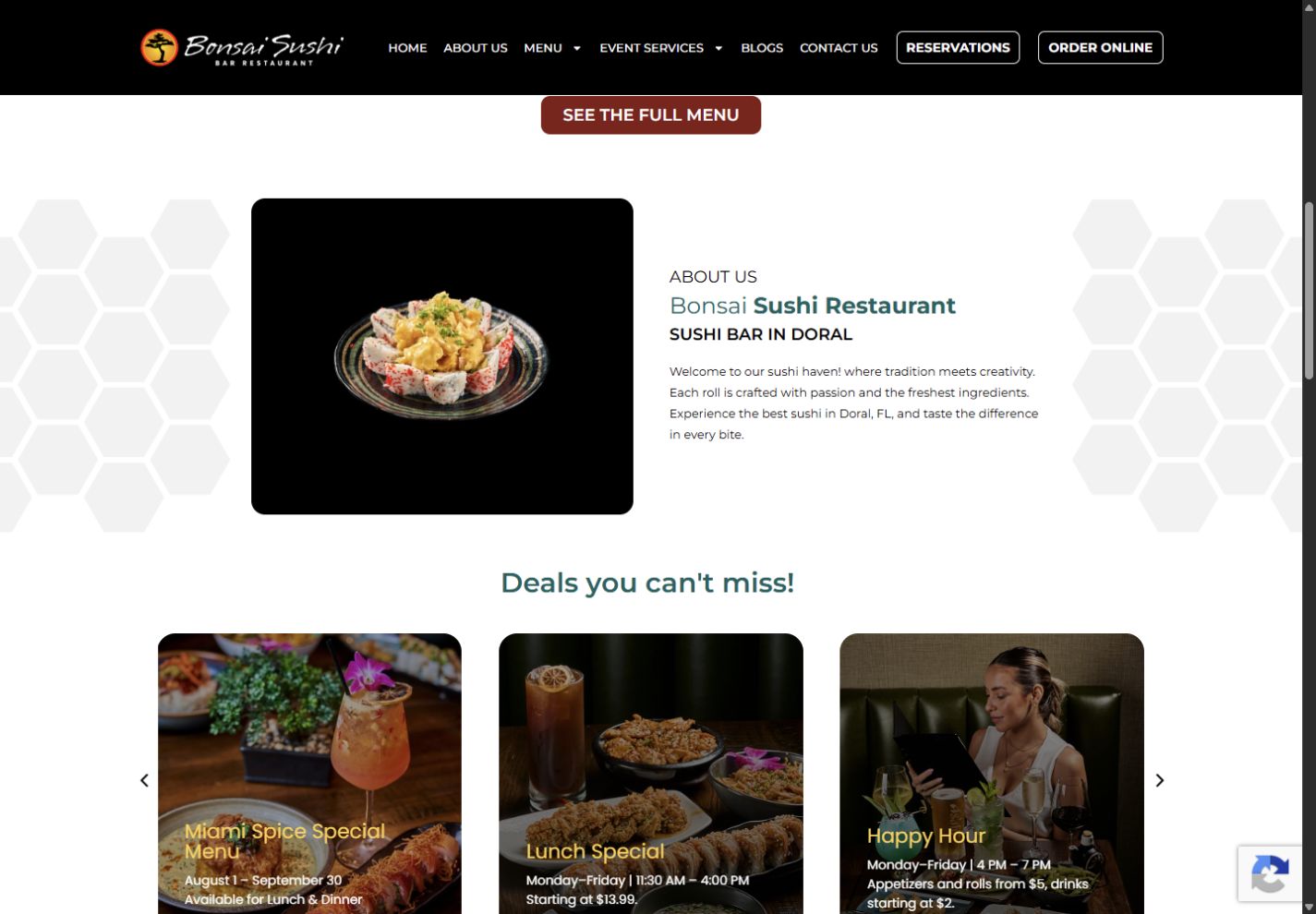
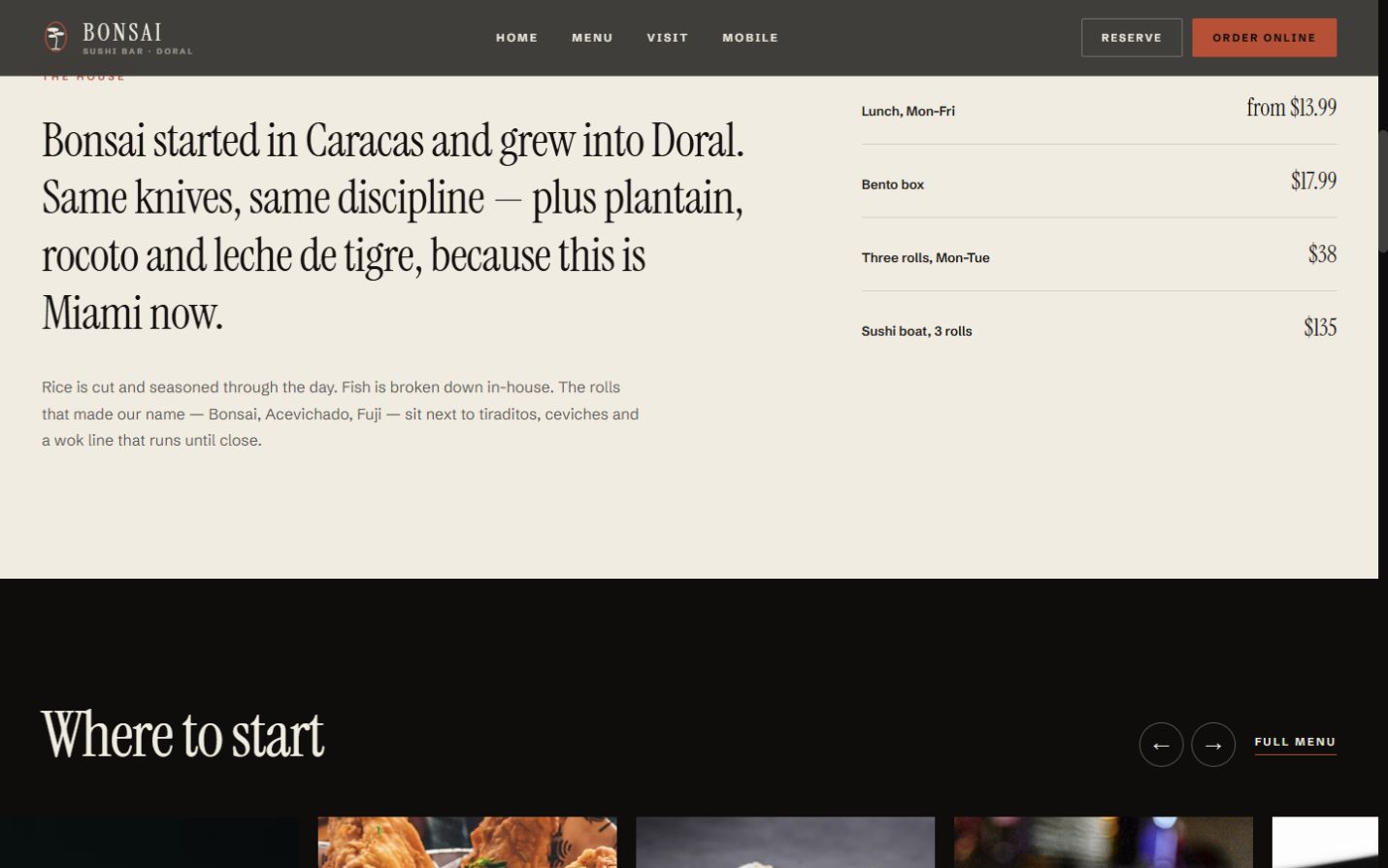
Every chapter places the current public experience beside the proposed redesign, making the change in hierarchy, pacing, and customer direction visible screen by screen.
The homepage leads with the food and holds only two actions: reserve or order online.
Photographed categories make the breadth of the menu an invitation instead of a wall of text.
Recurring offers are collected with their own days and hours, making the reason to visit legible at a glance.
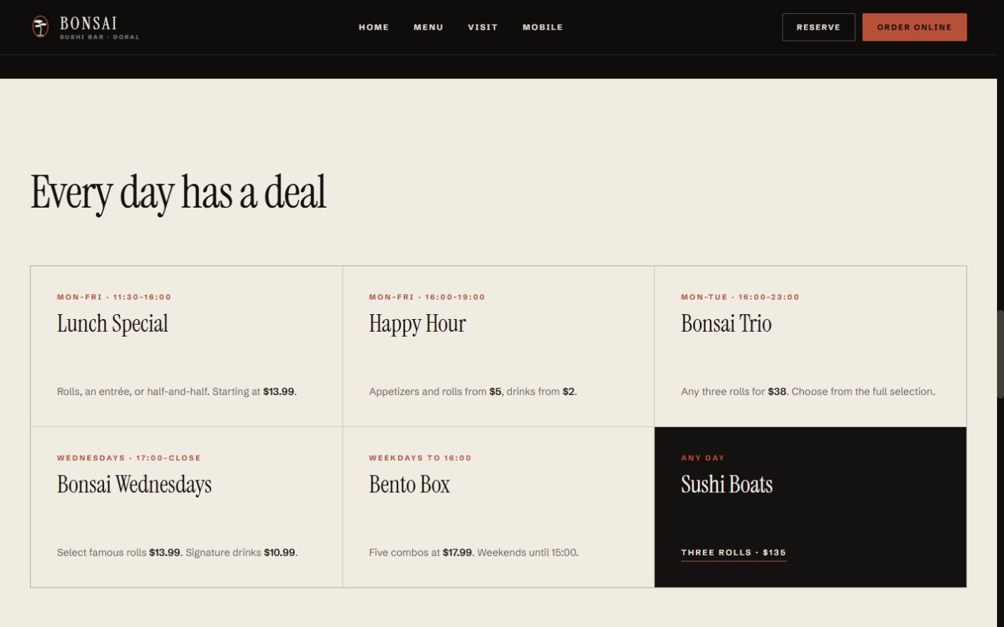
The restaurant story and a plain price summary resolve doubt before the reservation decision.
Address, hours, phone, directions, and booking finish on one screen with a view of the dining room.